Cannabis Design Clichés (and how to overcome them)
When designing for a cannabis brand, it's easy to fall into the trap of relying on overused visual elements and concepts that have become industry clichés. To stand out in this increasingly competitive market, it's essential to push beyond these predictable tropes and create a fresh, modern identity that resonates with today's diverse and evolving cannabis consumers.
Here are the top 5 most cliché design ideas:
Green Color Palette & Cannabis Leaf Imagery: The dominant use of green shades, especially paired with the cannabis leaf symbol, is perhaps the most overused design element. It’s become synonymous with cannabis brands, making it less unique and more predictable.
Psychedelic Patterns and Tie-Dye: Bold, swirling psychedelic patterns, often inspired by the 1960s and 70s counterculture, along with tie-dye effects, are commonly associated with cannabis culture but are now seen as dated and overdone.
Rasta Colors (Red, Yellow, Green): Incorporating the Rastafarian color scheme is another frequent choice, which has become a go-to for brands trying to evoke a laid-back or countercultural vibe. While it has cultural significance, its overuse can make it seem like a default option rather than a thoughtful design choice.
Trippy or Stoner Stereotypes: Designs that play heavily on stoner culture stereotypes—such as exaggerated depictions of cannabis enthusiasts, cartoonish eyes, and cloud motifs to represent being "high"—often lack sophistication and have become predictable.
Obvious "420" References: Using the number "420" in branding, packaging, or slogans is another cliché. While it's a well-known reference within cannabis culture, its constant use has made it less impactful and more of a design crutch.
These design ideas might resonate with certain audiences, but they can also pigeonhole a brand into a narrow image, limiting its broader appeal. Fresh, innovative approaches can help distinguish a cannabis brand from the saturated market.
To make your cannabis brand visually unique and stand out in a crowded market, consider the following strategies:
1. Explore Alternative Color Palettes
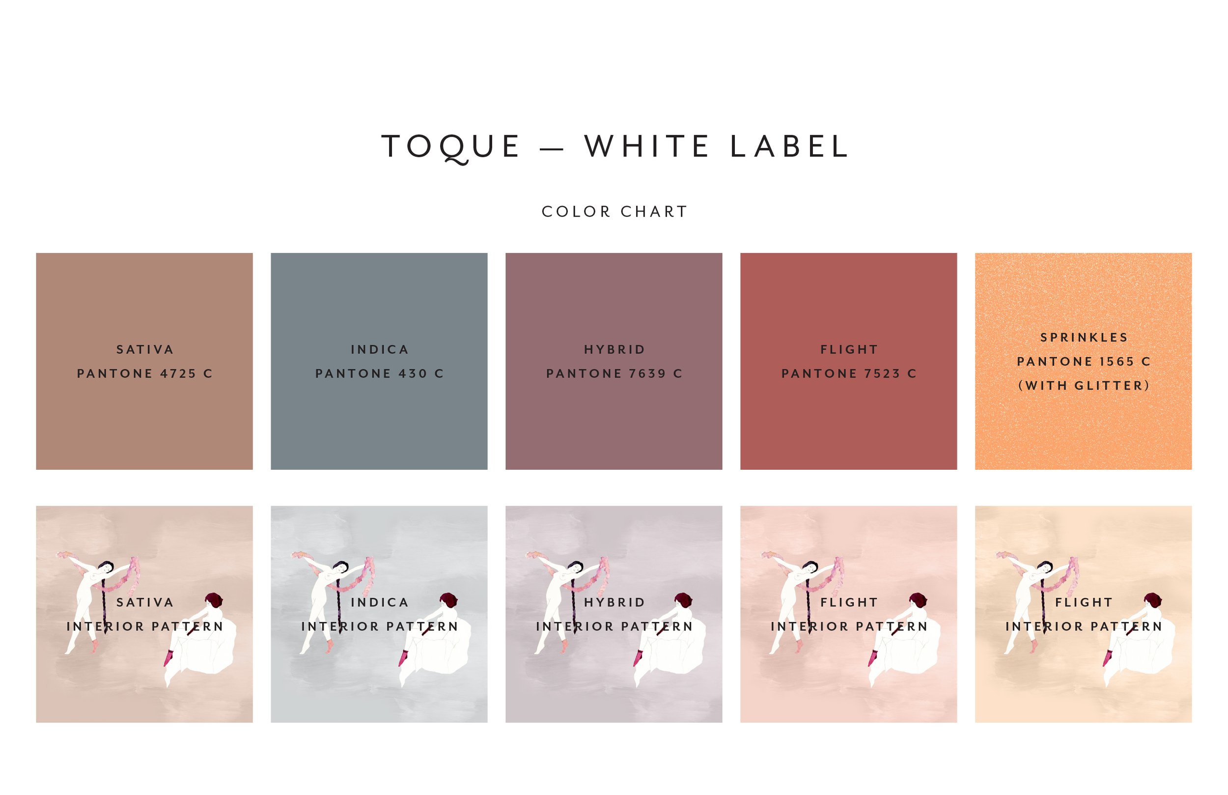
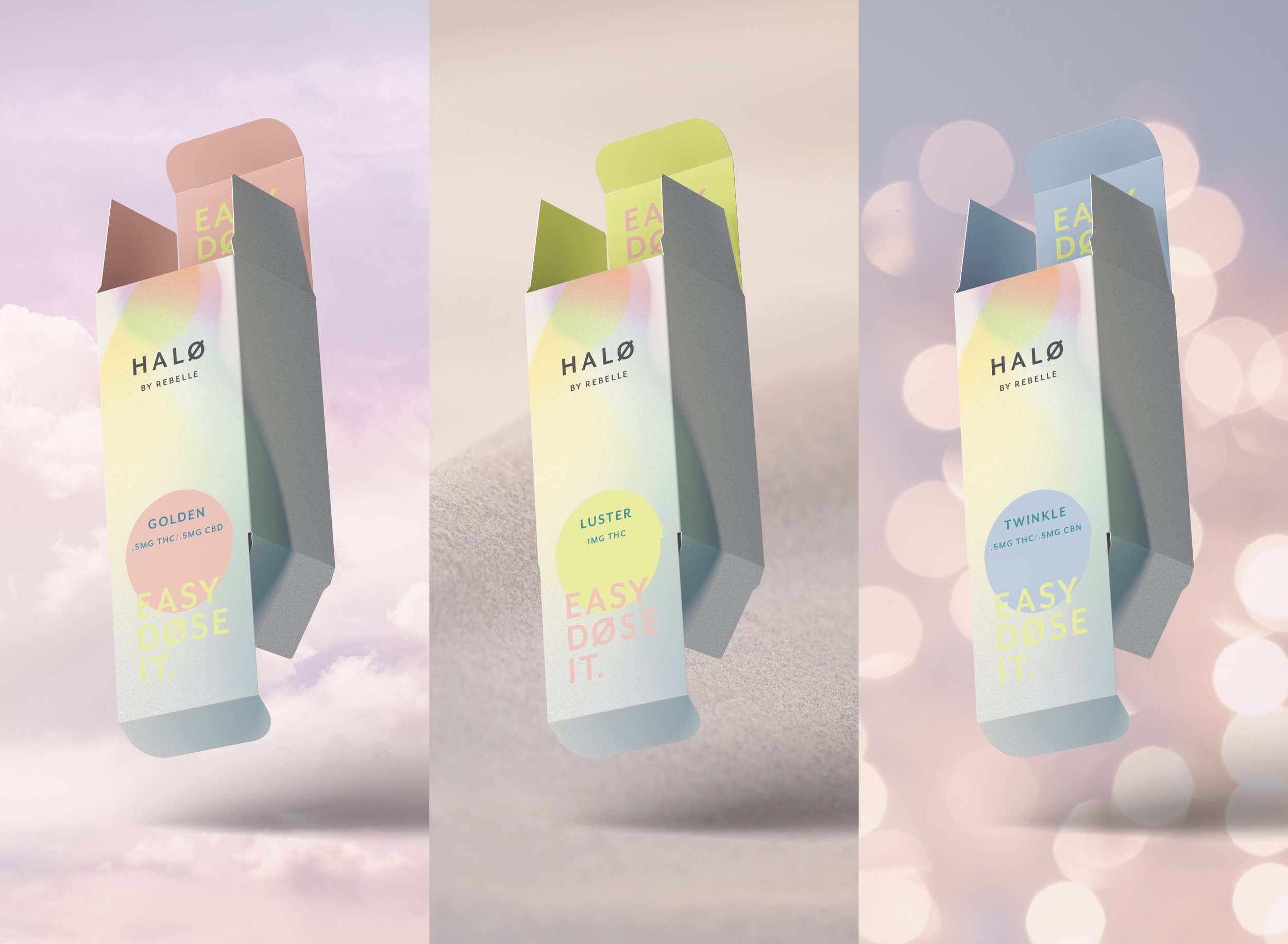
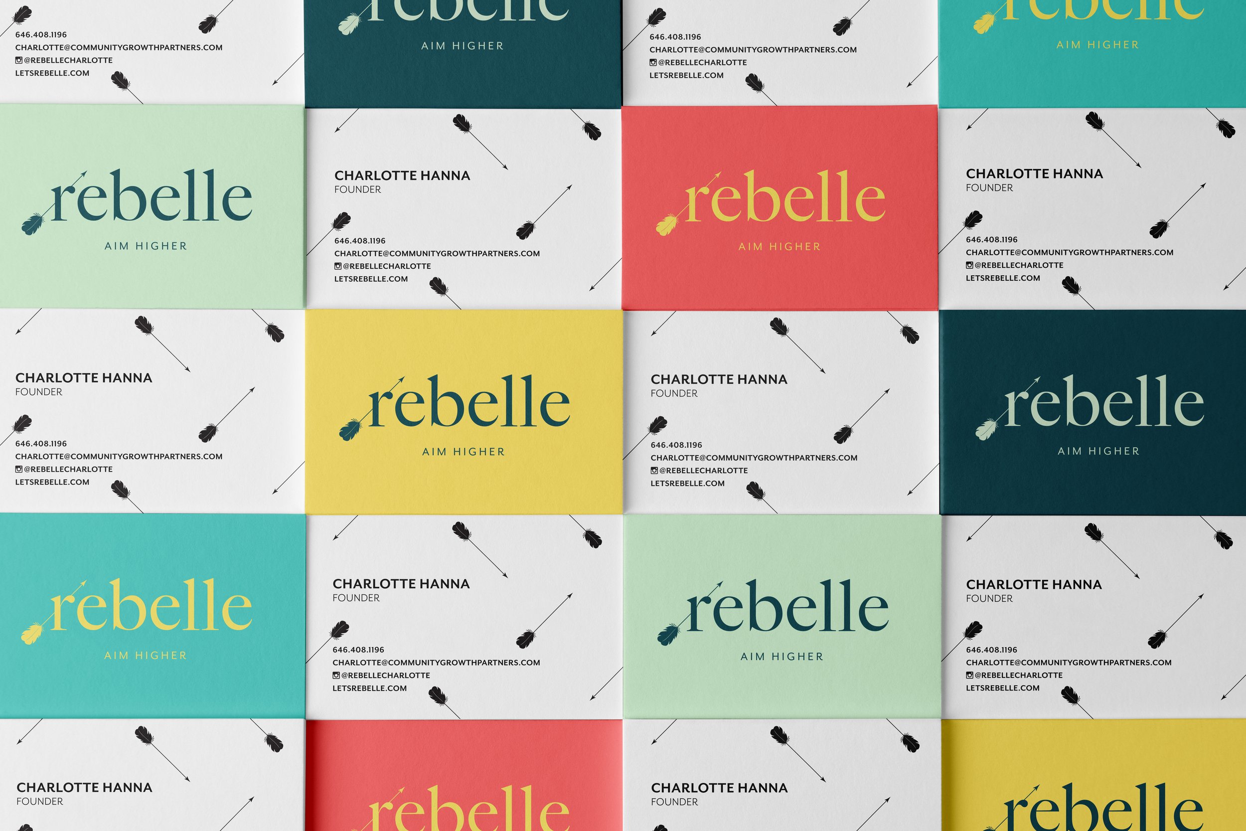
Avoid Green as the Dominant Color: Instead, experiment with unexpected color combinations that convey your brand's personality, like soft pastels, bold monochromes, or metallics.
Use Earth Tones with a Modern Twist: Incorporate muted or earthy tones with a contemporary edge, such as dusty pinks, deep navy, or charcoal gray, to evoke a natural feel without relying on traditional green.
2. Focus on Minimalist Design
Simplicity with a Twist: Embrace a clean, minimalist aesthetic that uses white space effectively, sharp typography, and subtle iconography. This approach can make your brand feel more sophisticated and premium.
Geometric Shapes and Patterns: Use modern geometric shapes or abstract patterns that aren’t directly related to cannabis but evoke a sense of calm, balance, or creativity.
3. Incorporate Storytelling through Imagery
Illustrative Narratives: Commission custom illustrations that tell the story of your brand, its origins, or the experience it offers. Think of artwork that can evoke emotions or ideas rather than obvious cannabis symbols.
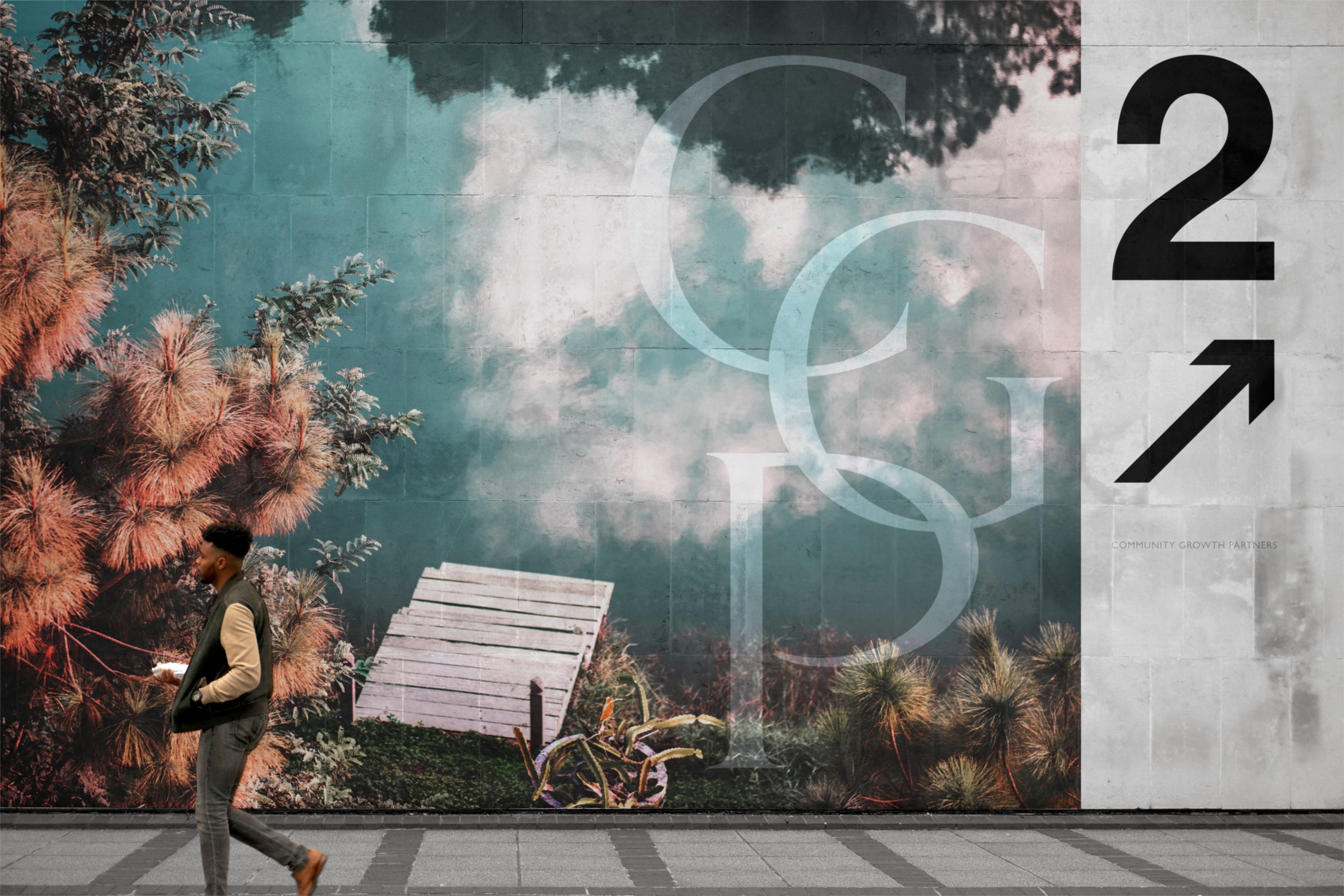
Lifestyle Photography: Use high-quality, lifestyle-focused photography that aligns with your brand values. For example, images of nature, wellness, or social connections can resonate more than the usual product-focused shots.
4. Cultural and Artistic Inspirations
Draw from Art Movements: Use inspiration from art movements like Bauhaus, Art Deco, or Mid-Century Modern to create a distinct visual language that feels timeless and innovative.
Global Influences: Incorporate subtle nods to global cultures or design aesthetics that align with your brand's ethos, like Japanese minimalism, Scandinavian design, or African textiles.
5. Innovative Packaging Design
Sustainable Materials: Opt for eco-friendly, sustainable packaging materials that are both functional and aesthetically pleasing. Bamboo, recycled paper, or glass can elevate the product's feel.
Unconventional Shapes: Design packaging that breaks the mold—think about unique shapes or textures that feel different in the hand and stand out on shelves.
Interactive Elements: Consider adding interactive elements to the packaging, such as QR codes that link to digital content, or packages that transform or have a second life (e.g., reusable tins, jars, or cases).
6. Elevate Your Brand’s Typography
Custom Typography: Develop a custom typeface or logo type that reflects your brand’s personality. It can be elegant, playful, or modern but should be distinct and memorable.
Bold & Contrasting Fonts: Use a combination of bold and contrasting fonts that complement each other while adding a modern touch to the overall design.
7. Craft a Unique Brand Voice
Distinctive Messaging: Your visual identity should be supported by a brand voice that’s distinctive. Whether it’s witty, serene, or authoritative, ensure that your design aligns with how you communicate with your audience.
Story-Driven Labels: Use your product labels to tell micro-stories or provide interesting, engaging information that adds value and connects with your audience on a deeper level.
By steering away from the clichés and being thoughtful in your design choices, your cannabis brand can carve out a unique niche and build a lasting impression.
Ultimately, as the client, you have the creative freedom to shape your brand's identity in any way you envision, regardless of design clichés. While it’s important to be aware of overused elements, it’s even more crucial to infuse your personal vision and values into the design, making it a true reflection of your brand's unique story. By focusing on authenticity and aligning the design with your brand’s mission and target audience, you can transform even the most familiar concepts into something fresh and compelling. The key lies in thoughtful execution, where your passion and creativity drive the design, ensuring that it stands out and resonates with your audience, regardless of trends. Let Dope People be your guide for that journey!


